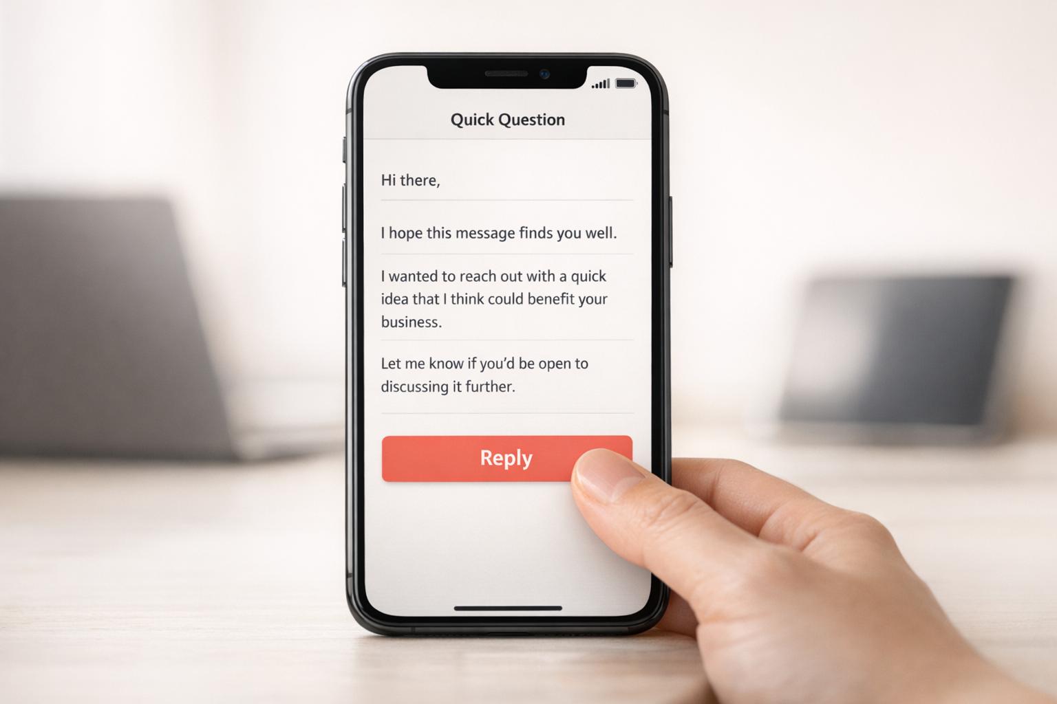
Why Mobile Optimization Matters for Cold Emails
Over 60% of email opens happen on mobile devices, and with recipients deciding in just 1.3 seconds whether to engage or delete, mobile optimization is no longer optional for cold email success. Poorly formatted emails can lead to 75% of users deleting them instantly, damaging your sender reputation and reducing deliverability.
Here’s why mobile-friendly cold emails matter:
- Engagement Boost: Short paragraphs, plain text, and mobile-optimized subject lines drive higher open and reply rates.
- Deliverability: Emails that perform poorly on mobile often end up in spam folders.
- User Experience: Poor design frustrates users, leading to deletions or spam reports.
Quick tips:
- Use a single-column layout (max width: 600px).
- Keep subject lines under 40 characters.
- Format text at 16px and buttons at 44x44px for touch-friendliness.
- Test emails across devices, especially for dark mode compatibility.
Tools like Icemail.ai simplify mobile-first email infrastructure with features like automated setups, ensuring your emails reach inboxes and perform well on mobile devices.
!Mobile Email Optimization Statistics and Impact{Mobile Email Optimization Statistics and Impact}
7 Rules to Design High Converting Responsive Emails
Problems Caused by Poor Mobile Optimization
When your cold emails aren’t designed for mobile, the consequences hit fast - and they keep piling up. These issues intensify the challenges you’re already facing, creating a downward spiral that can derail your outreach efforts entirely.
Lower Open Rates and Engagement
Mobile users don’t waste time. They decide whether to engage with an email in under two seconds. Something as simple as a two-line paragraph on desktop can balloon into five lines on a phone, creating a text-heavy appearance that leads to quick deletions [6].
Subject lines are another hurdle. Most mobile devices only show the first 30 characters, so if your hook doesn’t grab attention immediately, you’re in trouble [6]. In fact, 69% of recipients may mark emails as spam if the subject line doesn’t render properly [5].
The numbers tell the story. Mobile click rates lag behind desktop by 40% (2.7% vs. 3.8%) [5]. On top of that, the average mobile user spends just 10 seconds viewing an email [5]. Simpler formats like plain text emails perform better, achieving 23% higher reply rates than image-heavy designs that slow down loading times [4].
These engagement gaps aren’t just missed opportunities - they also set off a chain reaction that impacts deliverability.
Deliverability Issues and Spam Filters
When emails perform poorly on mobile, it sends negative signals to email service providers (ESPs). For example, if recipients delete your emails without reading them, ESPs interpret this as low engagement [1]. Over time, this damages your sender reputation, making it more likely your emails will end up in spam folders.
"Mobile-unfriendly emails get deleted without reading. Deleted-without-reading is a negative engagement signal. Negative engagement signals tank your sender reputation." - Mailflow Authority [1]
The stats back this up: one in six marketing emails never makes it to the inbox due to deliverability problems [5]. Gmail adds another layer of complexity by clipping emails over 102KB, which can hide your call to action entirely [2].
The benefits of mobile optimization are clear. In January 2026, Dr. Squatch fixed inbox placement and mobile visibility issues, resulting in a 112% increase in email revenue within just 24 hours. Their open rates jumped by 42%, and click-through rates (CTR) soared by 67% [5]. Similarly, StickerYou saw a 20% revenue boost on the first day of addressing mobile issues, growing to a 100% increase by the end of the month, along with major improvements in open rates and CTR [5].
But beyond the metrics, poor design on mobile directly frustrates your audience.
User Frustration from Bad Design
Think about when people check emails on their phones - while standing in line, during a quick break, or even in traffic. These are fleeting moments, and any design friction means your email gets abandoned instantly [2].
One common issue is touch target failures. Buttons or links that are too small or placed too close together often lead to accidental taps. This not only frustrates users but can also result in spam reports [1].
Another problem is iOS auto-zoom. If your text is smaller than 13 pixels, the system zooms in, disrupting your layout and making your email harder to read [1]. And with over 80% of users now enabling dark mode at least occasionally [2], emails that ignore color inversion can become unreadable - dark logos might disappear against dark backgrounds entirely.
| Element | Minimum Size | Recommended Size | Why It Matters |
|---|---|---|---|
| Body Text | 14px | 16px | Prevents iOS auto-zoom and reduces eye strain |
| Touch Targets | 44x44px | 48x48px | Reduces mis-taps and spam reports |
| Headlines | 22px | 24–28px | Ensures scannability in quick sessions |
The financial consequences are no less severe. A 2% drop in mobile conversion rates can eat into your profit margins and drive up your cost per acquisition [3]. And when 50% of users delete poorly optimized emails on sight [5], it’s like throwing money away on outreach that never had a chance to succeed.
Benefits of Mobile-Optimized Cold Emails
Making your cold emails mobile-friendly can instantly improve engagement while also protecting your sender reputation.
Higher Open and Reply Rates
Did you know that over 60% of B2B emails are opened on mobile devices? And here’s the kicker: recipients decide whether to engage in just 1.3 seconds [4]. If your email looks like a cluttered wall of text, you’re likely losing them before they even start.
Here’s how formatting impacts your reply rates:
- Emails with 45–55% whitespace see a 3.4% reply rate, compared to just 1.3% for emails with less than 25% whitespace [4].
- Short paragraphs (1–2 lines) perform better, averaging a 3.5% reply rate, while longer paragraphs (6+ lines) drop to 1.2% [4].
- Keeping word count in check also matters. Emails between 75–100 words achieve a 3.8% reply rate, but stretching to 200–300 words causes reply rates to plummet to 1.4% [7].
Plain text emails are another win. They outperform image-heavy designs by 23% in reply rates because they load faster on mobile networks [4].
By focusing on these details, you’re not just boosting reply rates - you’re creating a better experience for mobile users.
Better User Experience
Think about how people check emails on their phones: standing in line, between meetings, or during a quick break. Your email needs to work seamlessly in these brief, fragmented moments.
Here’s what helps:
- Use touch-friendly buttons sized at 44x44px to prevent accidental taps [1].
- Stick to a single-column layout (max width: 600px) and set body text at 16px to avoid auto-zoom issues on iOS [1].
- Make the first 40–60 characters of your preview text count. Avoid generic openers like “I hope this email finds you well” and instead highlight your value proposition upfront [8].
When your emails are easy to read and interact with on mobile, it not only improves user satisfaction but also signals quality to email providers, which can boost deliverability.
Better Deliverability and Sender Reputation
A poor mobile experience can tank your email performance. Here’s why: 75% of users delete emails immediately if they don’t display properly on mobile [2]. These deletions send negative signals to email providers, reducing your deliverability and making it harder to reach inboxes.
Worse yet, poorly designed touch targets can lead to accidental clicks on the wrong links, frustrating users to the point where they mark your email as spam [1]. Every spam complaint further damages your sender reputation with ISPs.
How to Optimize Cold Emails for Mobile
Make your cold emails smartphone-friendly with these practical tips.
Use Single-Column Layouts and Readable Fonts
Multi-column designs can be a headache on mobile screens. They often require readers to zoom in or scroll sideways, which disrupts the experience. Stick with a single-column layout - set the width to 600px for desktop and 100% for mobile [1][2].
Font choice is just as important. Go for clean, easy-to-read sans-serif fonts like Arial or Helvetica. Use at least 14px for body text to avoid layout issues like automatic zooming on iOS devices. For headlines, aim for 22–28px to establish a clear visual hierarchy without overwhelming the screen.
Here's a handy table for font sizes:
| Element | Minimum Size | Recommended Size |
|---|---|---|
| Body Text | 14px | 16px |
| Headlines | 22px | 24–28px |
| CTA Button Text | 16px | 18px |
| Small/Legal Text | 12px | 13–14px |
Plain text emails are another great option - they load faster and work better on mobile networks.
Keep Subject Lines and Preheaders Short
Your subject line and preheader text are critical - they’re the first things recipients see when deciding whether to open your email. On mobile, subject lines longer than 40 characters might get cut off [10].
Aim for subject lines between 21–40 characters, as this range can yield open rates of up to 49.1% [10]. For preheaders, keep it between 40–90 characters to give readers a clear idea of what’s inside [2][9].
Avoid wasting space with generic phrases like "I hope this finds you well." Instead, focus on delivering your main value within the first 40–60 characters to ensure it’s visible on mobile and grabs attention immediately.
Optimize Images and Add ALT Text
Images can slow down your email and even trigger spam filters if not handled correctly. Keep individual image sizes under 200KB and the total email size below 102KB to avoid Gmail clipping your message [2].
Use CSS rules like max-width: 100% and height: auto to make sure images adjust properly to different screen sizes [1][9]. Don’t forget to include ALT text for every image. This improves accessibility and ensures your message still gets across, even if images are blocked by default on some mobile email clients.
Place CTAs Above the Fold
On mobile devices, "above the fold" refers to the first 300–400 pixels of your email - the part visible without scrolling [2]. Place your primary call-to-action (CTA) here so it’s immediately accessible. Make CTA buttons at least 44×44px with 10px of surrounding whitespace to prevent accidental clicks [1][2][13].
"I test every client's email templates on my phone before approving them. The #1 mobile issue isn't layout - it’s buttons that are too small and too close together."
- Braedon, Mailflow Authority [1]
Spacing matters. Crowded buttons frustrate users and can damage your sender reputation.
Test Across Devices and Platforms
Once you’ve refined your email’s layout, fonts, and images, it’s time to test. Use tools like Litmus or Email on Acid (now part of Mailgun Inspect) to preview how your email looks across clients like iOS Mail, Gmail, and Android [11][12][2]. While these tools are helpful, nothing beats testing on real devices for an authentic user experience.
Don’t forget to test for dark mode using media queries like @media (prefers-color-scheme: dark) to ensure your text remains readable against dark backgrounds.
Pay close attention to iPhones, which account for around 90% of all mobile email opens [13]. If your emails don’t work well on iOS, you’re likely losing a big chunk of your audience.
How Icemail.ai Supports Mobile-First Cold Email Infrastructure
!Icemail.ai
Icemail.ai simplifies the process of setting up a mobile-friendly cold email infrastructure. This platform, tailored for cold outreach, offers automated setups and bulk mailbox purchases starting at just $2.50 per month (compatible with Google Workspace and Microsoft 365). It takes care of essential technical configurations - like DKIM, DMARC, and SPF - ensuring your emails land in mobile inboxes instead of being flagged as spam. These features are the foundation for effective mobile-focused email campaigns.
Icemail.ai Features for Mobile Optimization
With Icemail.ai, onboarding takes just 10 minutes, reducing the risk of setup mistakes that can harm email deliverability. Its automated DNS management eliminates manual errors that often trigger spam filters, ensuring your mobile-friendly email designs and short, impactful subject lines actually reach your audience.
The platform also provides US-based IP addresses with an impressive 99.2% inbox delivery rate [14]. You can bulk-purchase mailboxes using AI-powered autofill and even manage profile pictures across multiple accounts simultaneously. This is perfect for A/B testing mobile-specific elements like above-the-fold CTAs and responsive images. Plus, unlimited free mailbox replacements keep campaigns running smoothly while maintaining a strong sender reputation.
"icemail.io has transformed how I manage my email infrastructure. The automated setup for Google Workspace accounts, including DKIM, SPF, and DMARC configuration, saved me hours of work." - Suprava Sabat, AcquisitionX [14]
By focusing on the technical aspects that enable seamless mobile rendering, Icemail.ai ensures your cold emails are optimized for a mobile-first audience.
Icemail.ai vs. Competitors
Compared to other platforms, Icemail.ai delivers stronger results for mobile-focused email campaigns:
| Feature | Icemail.ai | Mailchimp |
|---|---|---|
| Pricing | $2.50/mailbox | $10+/mailbox |
| Setup Speed | 10-minute automated onboarding | 1–2 days manual DNS configuration |
| Deliverability | Auto DKIM/DMARC/SPF, 99.2% inbox rate | Basic SPF, 85–90% inbox rates |
| Mailbox Replacement | Unlimited free replacements | Costs incurred for replacements |
| IP Quality | Dedicated US-based IPs | Standard shared IPs |
These distinctions make a noticeable difference. Experts at ScaleMath report that automated setups like Icemail.ai's improve deliverability by 30% for mobile-first audiences, where 58% of email opens happen on smartphones. One SaaS company even saw its reply rates double to 8% after switching from Mailchimp, attributing the improvement to Icemail.ai's dependable mobile rendering and ability to scale without blacklist risks.
Conclusion
Optimizing for mobile isn't just a nice-to-have for cold emails - it's a must. With most B2B emails being opened on mobile devices, how your email looks on a small screen can make or break its chances of being read. Recipients spend just 1.3 seconds deciding whether to engage or delete, so poor mobile formatting can lead to quick deletions and hurt your sender reputation [4].
But it’s not just about how the email looks. The technical side is equally important. Proper authentication helps emails avoid spam filters, while keeping emails under 102KB, using fonts of at least 14px, and designing CTAs with a minimum size of 44×44px ensures a smooth mobile experience [2].
"Mobile isn't optional - it's the primary way people read email." - BillionVerify [2]
For those who find the technical aspects overwhelming, Icemail.ai - Cold email Infrastructure (Buy Google and Microsoft Mailboxes at $2) simplifies things. It automates DNS setup, manages authentication protocols, and ensures a 99.2% inbox rate using US-based IPs [14]. At $2.50 per mailbox, with a quick 10-minute setup and unlimited free replacements, it eliminates the infrastructure headaches that often derail mobile deliverability.
The data speaks volumes: formatting alone can increase reply rates by up to 40% [4]. Stick to the essentials - single-column layouts, short paragraphs, and plain text. Then, let automation handle the technical heavy lifting. When you combine clean design with reliable infrastructure, mobile-friendly emails become the cornerstone of effective outreach, ensuring your message gets seen and safeguarding your reputation.
Related reading
- how to improve engagement through better segmentation
- boost engagement metrics for your outreach campaigns
- avoid common spam trigger words for better readability
- personalize bulk campaigns with dynamic variables
- testing subject lines to improve mobile open rates
- boost reply rates with effective cold openers
- diagnose why cold emails land in spam folders